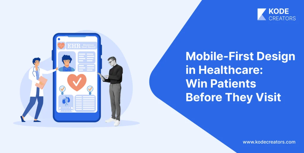


Most patients now prefer accessing healthcare through their smartphones, yet the majority of medical platforms remain stubbornly designed for desktop screens. The disconnect is costing time and money for patients as well as doctors. They abandon medication refills because pharmacy apps are unreadable, miss critical test results buried in desktop-optimized portals and skip telehealth appointments due to confusing mobile interfaces. Meanwhile, healthcare organizations wonder why their million-dollar patient portals have 12% adoption rates while Instagram gets opened 30 times a day.
The smartphone has become healthcare's primary interface, handling everything from emergency symptom checks to chronic disease management. Organizations still treating mobile as an afterthought are hemorrhaging patient engagement while competitors who prioritized mobile-first design report 3x higher portal usage and significantly better health outcomes. The choice is clear: design for the device patients actually use, or watch them find providers who do.
Let’s learn more about why mobile-first design matters more in healthcare.
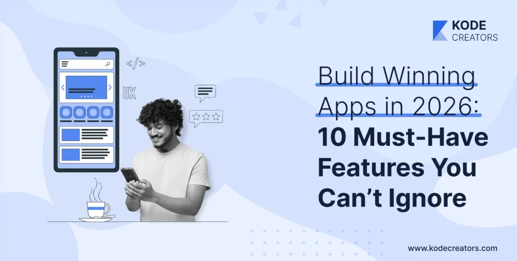
What Is Mobile-First Design (and Why Healthcare Can't Ignore It)
Mobile-first design means building for the smallest screen first, then expanding features for larger devices – the opposite of traditional development that shrinks desktop sites into cramped mobile versions. You design for constraints first: limited screen space, touch interactions, variable connectivity. When these work perfectly, scaling up to tablets and desktops is simple. Scaling down from desktop? That's how you get unreadable lab results and appointment forms that require magnifying glasses.
Healthcare's user complexity makes mobile-first essential, not optional. A cardiac patient checking readings at 6 AM uses different features than their cardiologist reviewing trends during rounds, yet both need the same app. Insurance verifiers process claims on phones between meetings. Family caregivers monitor elderly parents from work. Each user has different needs, urgency levels, and technical skills – complexity that breaks when you try cramming desktop interfaces onto phones.
The distinction matters: mobile-friendly means your desktop site technically works on phones (with lots of pinching and scrolling). Responsive design adapts layouts across devices but often just rearranges desktop elements. Mobile-first fundamentally rethinks the experience for mobile constraints and behaviors. It's why successful healthcare apps feel native to phones rather than miniaturized websites. The difference determines whether patients actually use your platform or download competitors' apps that understand mobile isn't just a smaller screen – it's a completely different interaction paradigm.
Why Mobile-First Matters More Than Ever in Healthcare
Improved Patient Engagement happens when healthcare fits into daily life, not the other way around. Mobile-first portals see 3x more daily logins than desktop-dependent systems because patients check health data like they check email – quickly, frequently, habitually. Self-management actually works when glucose logging takes two taps, not five minutes of computer startup.
Telehealth Accessibility determines whether virtual care succeeds or frustrates everyone involved. Mobile-first telehealth apps automatically adjust video quality for bandwidth, provide one-tap joining (no downloading plugins or remembering passwords), and handle the reality that 65% of telehealth visits happen on phones. Poor mobile design creates the nightmare scenario: elderly patients squinting at tiny "Join Call" buttons while doctors wait in empty virtual rooms. Proper mobile-first design means pre-visit tech checks, clear audio-only fallbacks, and interfaces that work whether patients are tech-savvy or still figuring out FaceTime.
Care Continuity breaks without mobile-first thinking. Test results arriving via push notification get seen immediately; desktop-only portals requiring login might go unchecked for weeks. Appointment reminders that link directly to mobile calendars prevent no-shows. Post-discharge instructions accessible offline on phones reduce readmissions. Real-time alerts about prescription readiness or insurance approvals keep care moving forward instead of stalling at every communication gap.
Operational Efficiency skyrockets when staff aren't chained to workstations. Nurses updating charts bedside through mobile interfaces spend more time with patients. Doctors reviewing overnight alerts during morning commutes arrive prepared. Administrative staff processing authorizations from anywhere eliminates bottlenecks. Mobile dashboards showing real-time bed availability, staff locations, and patient flow optimize operations minute-by-minute, not shift-by-shift.
Equity and reach become achievable because smartphones have penetrated communities where computers never did. Rural patients without broadband still have cellular coverage. Low-income families might share one smartphone but rarely have dedicated computers. Mobile-first design doesn't just improve convenience – it provides the only viable access path for millions who'd otherwise remain disconnected from digital healthcare.
Mobile Healthcare Users: Who Are We Designing For?
Patients: Gen Z expects healthcare apps to work like TikTok – instant, intuitive, addictive. Meanwhile, 75-year-olds need larger fonts, simpler navigation, and voice assistance for arthritis-impaired hands. The diabetic teenager wants gamified glucose tracking; the elderly cardiac patient needs medication reminders they can't accidentally dismiss. Same app, completely different humans. Successful mobile-first design acknowledges this isn't one audience but dozens, each requiring specific accommodations without compromising others' experiences.
Clinicians: They're not casually browsing – they're reviewing critical labs while walking between rooms, entering notes during patient conversations, responding to alerts in parking lots. They need interfaces optimized for speed and accuracy under pressure. One-handed operation matters when the other hand holds equipment. Voice input matters when typing would break patient eye contact. Security features that work without disrupting clinical flow – biometric logins, not passwords typed 50 times per shift.
Administrators: They track operations from everywhere except their desks. They check bed capacity during breakfast, review staffing from conference rooms, and approve purchases between meetings. Mobile dashboards must convey complex metrics on small screens without sacrificing decision-making clarity.
Care Partners: These are healthcare's hidden users – adult children managing aging parents' care, spouses tracking medication schedules, home health aides documenting visits. They need selective access, simplified interfaces, and clear boundaries between their access and patient privacy.
Persona-driven design in healthcare isn't marketing fluff – it's the difference between apps that work theoretically versus those that work when your grandmother has chest pain at 2 AM or when doctors have 30 seconds between critical patients.
Key Principles of Mobile-First Healthcare Design
Prioritize Accessibility (WCAG & ADA): Healthcare apps that aren't accessible aren't just losing users – they're violating federal law. Text must scale to 200% without breaking layouts because diabetic retinopathy doesn't care about your design aesthetics. Contrast ratios of 4.5:1 aren't suggestions when patients check medications in dim hospital rooms. Voice assistance isn't a nice-to-have when arthritis makes typing impossible. Every tap target needs a 44x44 pixel minimum because tremors don't improve with age.
Simplify Data Density: Medical information overwhelming on desktop screens – on mobile, it's unreadable chaos. Lab results need progressive disclosure: show abnormal values first, details on tap. Medication lists require clear hierarchies: current meds prominent, discontinued drugs accessible but subdued. Vital signs display best as trends, not tables. The art is showing enough for informed decisions without requiring a magnifying glass.
Optimize Workflows: Every unnecessary tap is a patient lost. Appointment booking should take three taps maximum: select provider, pick time, confirm. Telehealth entry can't require remembering passwords – biometric login or magic links only. Prescription refills need one-tap ordering with saved pharmacy preferences. Complex workflows kill adherence faster than side effects.
Secure by Design: HIPAA compliance shapes every interaction. Auto-timeout after inactivity, but with warning countdowns that prevent mid-task lockouts. Biometric authentication that actually works with wet or aging fingers. Screenshots disabled on sensitive screens. Security that protects without making healthcare harder to access.
Consistent Microinteractions: Anxious patients don't need surprises. Buttons should look tappable, behave predictably, and confirm actions clearly. Loading states must indicate progress, not just spin endlessly. Error messages need human language explaining how to fix problems, not cryptic codes.
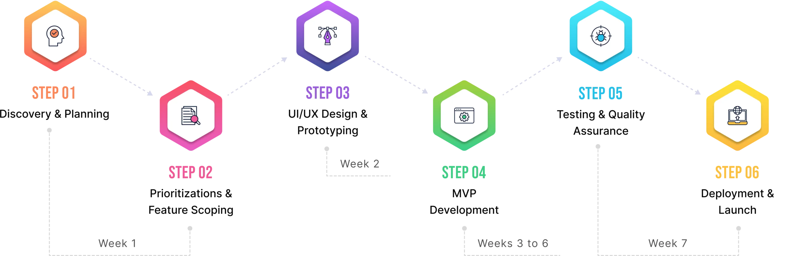
Best Practices for Building Mobile-First Healthcare Products
Start with Mobile Wireframes: Forget desktop entirely during initial design. Sketch for a 375-pixel wide screen first – if it works there, scaling up is simple. Desktop-first teams constantly discover features that simply don't fit on phones, triggering expensive redesigns. Mobile wireframes force brutal prioritization: what actually matters when screen space is precious? That cluttered dashboard becomes a focused, actionable interface when mobile constraints drive decisions.
Test on Actual Devices Early: Simulators lie. That perfect design on your Mac looks broken on a three-year-old Android with a cracked screen – exactly what many patients use. Test on real devices weekly, not just before launch. Watch elderly patients struggle with your "intuitive" interface. See how glare affects readability. Discover that critical button sits exactly where phone cases block taps.
Integrate Feedback Loops: Beta testing with actual patients reveals problems no designer anticipates. That medication reminder they loved in concept? Annoying at dinner time. Clinician studies expose workflow breaks – doctors need horizontal orientation for data entry but vertical for review. Build feedback mechanisms into apps: shake to report bugs, one-tap satisfaction ratings after key tasks.
Apply Progressive Disclosure: Don't dump everything on screen one. Show critical information first, details on demand. Lab results start with abnormal values highlighted, tap for trends, swipe for historical data. Complex forms reveal sections as users complete them, preventing overwhelming walls of fields.
Employ Scalable Architecture: APIs must handle everything from Apple Watches to tablets without separate codebases. Design systems that adapt, not break.
Ensure Cross-Platform Consistency: iOS and Android users deserve identical experiences. Features missing on one platform frustrate patients and fragment support efforts.
Common Mistakes (and How to Avoid Them)
Copy-pasting desktop design: This creates unusable mobile experiences. That comprehensive dashboard becomes an infinite scroll of microscopic charts. The solution isn't shrinking – it's rethinking. Mobile needs a different information architecture, not miniaturized desktop layouts. Redesign for thumb navigation, prioritize critical actions, and hide secondary features behind progressive menus.
Ignoring low-bandwidth users: This excludes rural and low-income patients. Your app might work perfectly on office WiFi but fail completely on spotty cellular connections. Images that don't load, videos that buffer endlessly, features that timeout – these aren't edge cases when 30% of patients have limited data plans. Implement lazy loading, compress everything, and provide text alternatives for media.
Overloading apps with features: Adding everything stakeholders request creates bloated disasters. That app handles appointments, medications, billing, messaging, education, and social features? Nobody uses it because finding anything takes forever. Start with core functionality, nail it, then carefully add features based on actual usage data, not wishlists.
Forgetting offline functionality: This breaks healthcare at critical moments. Patients need access to medication lists during pharmacy visits in dead zones. Emergency contacts must be available when networks fail. Cache essential data locally, sync when connected, clearly indicate what's available offline.
Neglecting security UX: Complex security makes compliance worse, not better. Multi-factor authentication that requires six steps? Disabled immediately. Password requirements so complex they're written on sticky notes? Security theater. Design security that works with human behavior: biometric defaults, smart re-authentication only for sensitive actions, clear explanations why security steps matter.
The Future of Mobile UX in Healthcare (2026 and Beyond)
The next five years will eliminate the distinction between "mobile health apps" and "healthcare" – your phone will become as essential to medical care as stethoscopes. These aren't incremental improvements but fundamental shifts in how humans interact with health technology.
AI-Driven Personalization: Your health app will learn you're left-handed and shift controls accordingly. It'll notice you always check lab results at lunch and pre-load them at 11:55. Diabetics who consistently log meals get streamlined food tracking; those who don't see medication reminders instead. The app adapts to how you actually use it, not how designers think you should. Menus rearrange based on your conditions – cardiac patients see heart metrics first, asthmatics get air quality warnings, pregnant users find prenatal vitamins without searching.
Voice & Chat Interfaces: Typing medical terms on phones is torture that's finally ending. "Schedule a cardiology appointment next week" beats navigating six screens. "What's this rash?" with a photo gets instant triage guidance. Voice interfaces work for grandma with arthritis and busy surgeons scrubbing in – no touching required.
AR/VR for Patient Education: Point your phone at your knee, see exactly where surgery will happen. Watch your actual heart rhythm overlaid on your chest. Physical therapy apps that detect incorrect form and adjust in real-time. Medical instructions that make sense because you're seeing, not reading.
Wearable & IoT Connectivity: Everything talks to your phone – glucose monitor, smart scale, blood pressure cuff, even your mattress tracking sleep quality. One dashboard showing actual health, not scattered numbers requiring medical degrees to interpret.
Global Health Inclusion: Pictures replace words for low-literacy populations. Interfaces adapt to right-to-left languages seamlessly. Cultural medical practices respected, not ignored.
Final Thoughts
Healthcare organizations are still building desktop portals while patients have already moved to mobile-only lives. Patients may miss critical test results because they can't read them on phones. They may skip medications because refill apps are unusable.
The organizations thriving in 2026 will understand that mobile-first design isn't about screen size, it's about meeting patients where they actually are. Every day, healthcare delays proper mobile implementation is another day patients suffer through pinching and zooming their way through critical health information, another day competitors gain ground, another day the gap widens between what patients expect and what healthcare delivers. The technology exists, the design principles are proven, and patients are literally holding the devices in their hands. The only question is whether healthcare will finally be designed for reality instead of nostalgia.