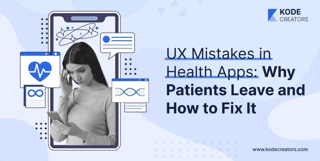
Most health apps don't have a marketing problem. They have a retention problem.
Users download your app when they're motivated—newly diagnosed, doctor recommended it, trying to get healthier. Then 95% of them disappear within a month.
That's not because they got better. It's because the app irked them enough to quit. Poor UX in healthcare isn't just annoying. A glucometer got recalled because its decimal point design caused insulin dosing errors. Bad design in health apps has real consequences.
This isn't about adding features. It's about fixing the seven UX mistakes that make patients give up before your app has a chance to help them.
Let's walk through each one and how to fix it.
Common UX Mistakes Hurting Patient Retention in Health Apps
1. Confusing or Overwhelming Onboarding
The Problem: Your onboarding asks for insurance details, complete medical history, emergency contacts, medication lists, and dietary preferences before showing any value. Medical apps average 23 fields during signup – banking apps average 6. Users encounter terms like "comorbidities" and "contraindications" within minutes of downloading. Generic tutorials explain features nobody asked about while ignoring actual user goals.
Why It Kills Retention: Patients download health apps during moments of motivation or medical need. That motivation evaporates when confronted with DMV-level bureaucracy. They're seeking help, not homework. When the first experience feels harder than the health problem itself, deletion follows immediately.
The Fix: Progressive onboarding that respects cognitive load. Start with one essential question: "What brought you here today?" Let everything else follow naturally. Replace medical jargon with human language – "other health conditions" not "comorbidities." Show value before demanding data. If someone wants to track blood pressure, let them log one reading before demanding their entire cardiovascular history. Personalize the journey based on their stated goal. The diabetes tracker shows different first steps than the meditation app. Use empathetic microcopy that acknowledges the emotional weight: "Let's take this one step at a time" beats "Complete all required fields."
2. Ignoring Accessibility and Age Inclusivity
The Problem: Your revolutionary health app uses 12-point fonts, light gray text on white backgrounds, and swipe gestures that assume everyone has perfect vision and steady hands. Color-coding that makes sense to designers becomes invisible to colorblind users. Voice-over support breaks on critical screens. The average health app user is 52, but the designs target 25-year-olds.
Why It Kills Retention: When 65-year-olds with arthritis can't tap tiny buttons, they don't struggle through – they quit. When visually impaired users hit dead ends with screen readers, they find alternatives. You're not just losing users; you're systematically excluding the populations who need health apps most.
The Fix: WCAG 2.2 compliance isn't bureaucracy – it's expanding your addressable market. Implement pinch-to-zoom everywhere, not just on images. Default fonts should be 16 points minimum with user-adjustable sizing. Contrast ratios of 4.5:1 aren't suggestions when patients check medications in dim hospital rooms. Replace complex gestures with clear buttons. Test with actual elderly users, not young employees pretending to be old. Include culturally neutral icons – that hamburger menu means nothing to billions globally.
3. Lack of Trust Cues and Data-Security Transparency
The Problem: Your app requests location access without explanation. Permission popups appear randomly. Privacy policies hide behind legal language nobody reads. HIPAA compliance badges are buried in settings. The first data entry screen provides zero assurance about where information goes or who sees it.
Why It Kills Retention: Healthcare data breaches average $10.9 million in damages because health information is irreplaceable. Patients know this. When apps feel sketchy about data handling, users choose the safer option: deletion. Trust, once broken in healthcare, never returns.
The Fix: Make security visible without being scary. Add trust badges where data entry happens, not hidden in footers. Explain permissions in context: "Location helps us find nearby pharmacies" beats "This app needs location access." Use progressive consent – ask for sensitive permissions only when features require them. Create visual privacy indicators showing when data syncs or stays local.
4. Overcomplicated Navigation and Cluttered Interfaces
The Problem: Your app has seven tabs, each with submenus. Colors follow no hierarchy – urgent alerts look identical to promotional messages. Icons change meaning between screens. Finding how to log a blood pressure reading requires three taps through unrelated sections. Feature creep turned your focused health tool into a Swiss Army knife nobody can figure out.
Why It Kills Retention: Cognitive load is finite, especially for sick people. When finding basic features requires detective work, users assume the app is broken or they're stupid. Neither feeling encourages continued use. Healthcare apps compete with exhaustion, brain fog, and medical anxiety – complexity guarantees abandonment.
The Fix: Embrace radical simplicity. One primary action per screen. Navigation that mirrors clinical workflows – symptoms lead to logging, logging leads to insights, insights lead to actions. Consistent iconography across the entire experience. If a heart means cardio here, it can't mean favorites there. Color hierarchy that respects urgency – red for critical, yellow for attention, green for positive, gray for everything else. The home screen should answer one question: "What do I need to do today?" Everything else is secondary. Hide advanced features behind progressive disclosure. Most users need three features, not thirty.
5. Push Notifications That Annoy Instead of Empower
The Problem: "Time to log your mood!" arrives during a funeral. "Don't forget your medication!" fires at 3 AM. Generic reminders ignore user patterns, sending identical messages regardless of engagement level. Notifications feel like nagging parents rather than supportive partners. The frequency assumes users have nothing else happening in their lives.
Why It Kills Retention: Notification fatigue is real. When every app screams for attention, users silence them all. Healthcare notifications that interrupt without adding value train users to ignore actually important alerts. The crying wolf effect means critical reminders get missed because routine ones annoyed users into disabling everything.
The Fix: Smart notifications require genuine intelligence. Learn user patterns – if someone always logs glucose after breakfast, don't remind them at breakfast. Emotional tone matters more than frequency. "Great job logging yesterday! Ready for today?" beats "REMINDER: LOG GLUCOSE NOW." Time notifications based on user activity, not arbitrary schedules. Provide granular control – let users specify which reminders they want, when, and how. Critical alerts should feel different from routine reminders through tone, appearance, and delivery method. Test notification effectiveness through engagement metrics, not just delivery rates.
6. Ignoring Emotional Design and Empathy
The Problem: Your mental health app looks like tax software. Cancer tracking apps use aggressive red everywhere. Fertility apps ignore the emotional weight of failed cycles. Clinical accuracy trumps emotional intelligence in every interaction. The voice feels robotic when users are vulnerable, celebratory when they're struggling.
Why It Kills Retention: Healthcare is emotional. Chronic illness brings grief. Mental health involves vulnerability. Fertility journeys include devastation. When apps ignore emotional context, they feel tone-deaf at best, cruel at worst. Users don't want clinical interactions – they want compassion with clinical benefits.
The Fix: Design for emotional states, not just functional tasks. Mental health apps need calming colors and gentle transitions. Chronic disease trackers should acknowledge bad days without judgment. Include breathing spaces in the design – white space that lets users process, not just consume. Micro-animations should soothe, not stimulate. The entire experience should feel like a trusted friend, not a medical device.
7. No Feedback Loops or Progress Visualization
The Problem: Users log data into a void. Blood pressure entered daily for months shows no trends. Exercise tracked religiously provides no insights. The app collects but doesn't communicate. Users can't tell if they're improving, declining, or stagnant. Milestones pass without acknowledgment.
Why It Kills Retention: Humans need feedback to maintain behavior. When effort feels pointless, motivation dies. Healthcare improvements happen slowly – without visualization, progress feels nonexistent. Users abandon apps that feel like one-way data collection rather than two-way health partnerships.
The Fix: Make progress visible and celebrated. Simple trend lines showing improvement motivate continued tracking. Milestone badges for consistency matter more than perfection – "7 days logged!" beats "Perfect scores!" Contextual insights explain what numbers mean: "Your average glucose is trending down – that's fantastic!" Progress bars for long-term goals maintain momentum during difficult stretches. Celebrate small wins prominently. Use positive reinforcement liberally but genuinely. Share insights that surprise and educate: "Your symptoms worsen on Tuesdays – possibly work stress?" The app should feel like an encouraging coach who notices effort and celebrates growth.
8. No Personalization or AI Assistance
The Problem: Everyone sees identical interfaces regardless of their condition, tech savvy, or preferences. The diabetes app shows pregnancy features to elderly men. Mental health apps recommend meditation to users who've indicated it doesn't help. One-size-fits-all approaches fit nobody well.
Why It Kills Retention: Generic experiences feel irrelevant. When apps don't adapt to individual needs, users adapt by leaving. Healthcare is personal – apps that ignore this feel disconnected from real health journeys.
The Fix: AI-driven personalization that learns and adapts. Dashboards that prioritize relevant metrics based on user conditions and goals. Predictive features that anticipate needs – suggesting glucose logging when patterns indicate usual testing times. Conversational AI that remembers previous interactions and provides continuity. Adaptive interfaces that simplify for basic users while providing depth for power users. Content recommendations based on engagement patterns, not assumptions. The app should feel increasingly tailored with use, not eternally generic.
Design Psychology for Patient Loyalty
Healthcare apps succeed when they understand the invisible psychology driving patient behavior. Emotional safety creates the foundation for vulnerability – users only share honest health data when they feel protected from judgment. This means error messages that guide rather than shame, progress tracking that acknowledges struggles alongside successes, and interactions that respect the courage required to face health challenges.
Autonomy support drives adherence better than authoritarian commands. Users who choose their reminder times comply 60% more than those assigned schedules. Customizable goals that respect individual capacity outperform rigid requirements. The app should feel like a tool users control, not a system controlling them.
Positive reinforcement loops create sustainable engagement. Variable rewards for consistency work better than predictable badges. Unexpected encouragement during difficult periods builds emotional connection. The surprise "You're doing great!" after a tough week matters more than routine congratulations. These psychological principles aren't manipulation – they're respecting how humans actually change behavior.
Compliance & Ethics: The Invisible UX Layer
HIPAA compliance shapes UX whether designers acknowledge it or not. Consent flows that feel burdensome often stem from poor regulatory interpretation. Smart UX transforms compliance from friction into trust-building. Progressive consent that explains why information is needed, when it's shared, and how users maintain control converts regulatory requirements into competitive advantages.
Ethical considerations extend beyond legal compliance. Dignity in design means never making users feel stupid for struggling with technology while sick. It means respecting that health data represents human vulnerability, not just database entries. Dark patterns that trick users into sharing more data or maintaining subscriptions violate healthcare's fundamental promise: first, do no harm.
The best mobile health apps make ethics visible through design. Clear data deletion options, transparent sharing policies, and respect for user autonomy aren't hidden in settings – they're woven throughout the experience. When compliance and ethics guide design decisions, trust follows naturally.
The Future: Intelligent UX for Smarter Retention
By the end of 2026, static interfaces will feel as outdated as paper forms. Adaptive UX will respond to user states in real-time – interfaces simplifying when stress is detected, celebrations amplifying during success periods, support intensifying during struggles. Your smartwatch will tell the app you're anxious, triggering calmer colours and gentler notifications.
Multimodal interaction will demolish accessibility barriers. Voice commands, gesture controls, and haptic feedback will provide multiple pathways to every feature. Users will interact however feels natural in the moment – speaking to log symptoms while driving, gesturing to navigate while eating, tapping when traditional interaction suits.
Predictive UX will anticipate needs before users recognize them. AI will notice patterns humans miss – prompting symptom logging when behavioural changes suggest flares beginning, adjusting medication reminders when sleep patterns indicate routine disruptions, and suggesting provider contact when data patterns match concerning trajectories.
Continuous feedback loops will eliminate the guesswork in UX optimization. Apps will detect frustration through interaction patterns, identify confusion through navigation loops, and recognize satisfaction through engagement depth. These signals will drive automatic improvements, creating experiences that evolve with user needs rather than remaining frozen at launch.
Key Takeaways
User retention in health apps directly impacts health outcomes – this isn't just business metrics but human welfare. Every UX friction point represents lost opportunities to improve lives. The apps succeeding in 2026 won't be those with the most features but those creating emotional connections through thoughtful, empathetic design.
Health apps must unite AI intelligence, emotional wisdom, and ethical grounding to create experiences that users don't just tolerate but embrace as essential health partners. The technology exists. The frameworks are proven. The only question is whether organizations will prioritize user retention as seriously as user acquisition.